Approach
Working alongside the PR team at Verge Scientific, we began with a deep dive into the company’s background, audience, and goals for the branding via Verge’s brand strategy workshop and “brandscape” analysis. This comprehensive overview provided a solid foundation as we explored the brand visuals and determined what messaging to emphasize.
The theme of accessibility and scalability emerged from our research, defining how Umoja’s goal is to expand access and to simplify cancer therapy with the potential to reach more patients.
They achieve this by retooling the immune system to do what it does naturally—fight disease—while solving conventional therapy issues of toxicity, manufacturing challenges and inconsistent efficacy.
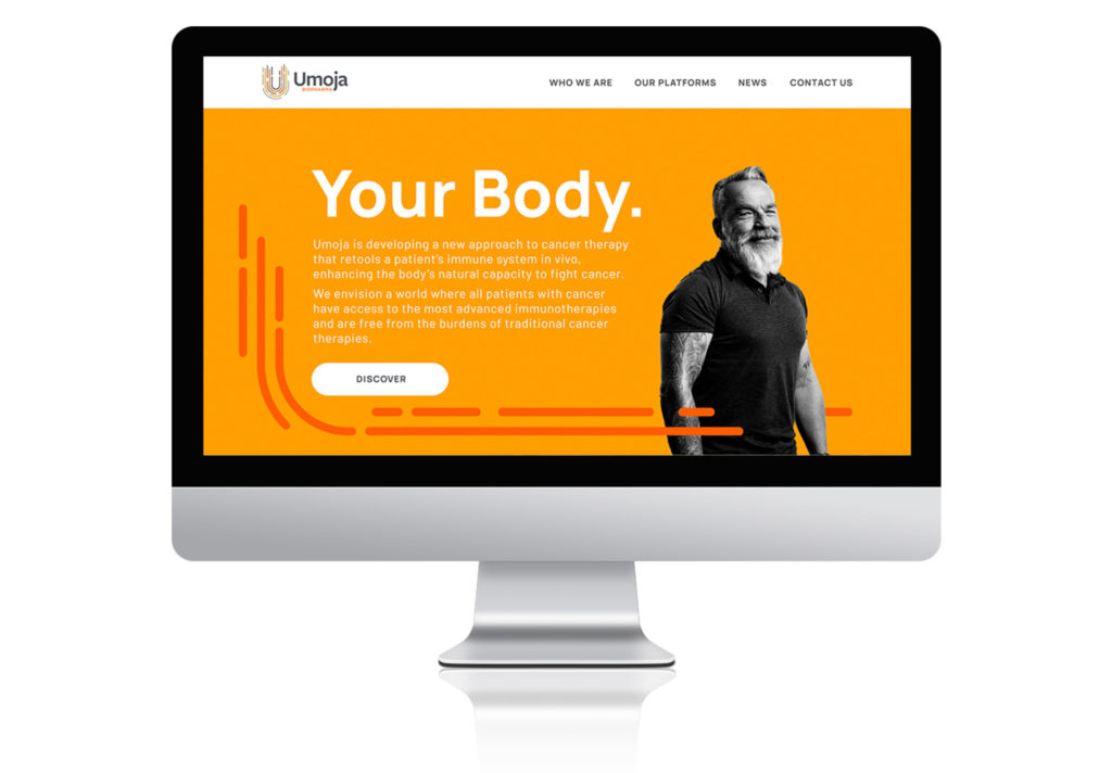
In bringing this brand to life, we leveraged Umoja’s logo for inspiration both in its use of color and shape. Bright yellows and oranges embody their brand’s personality, expressing ideas of drive, energy, empowerment, and innovation. To this we added teal blue to represent strategic thinking and accessibility. We wove the curved lines of the logo throughout our work, as they elegantly reference the lymphatic system and signify movement and progress.
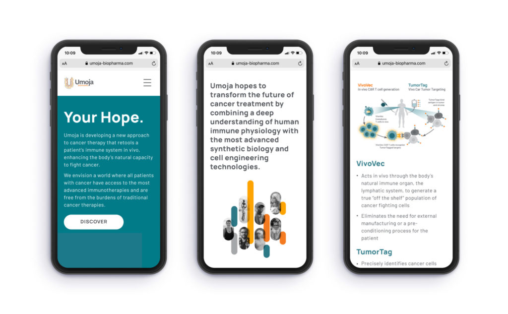
Patients of all ages and demographics, along with Umoja’s team of researchers, are represented through emotive black and white photography. The website homepage directly pairs patients with the text “Your Body. Your Hope. Your Cure” to drive home the point that we all have within us the ability to fight cancer…and it can be enhanced by Umoja’s therapies.
Investor-focused Corporate Capabilities Presentation
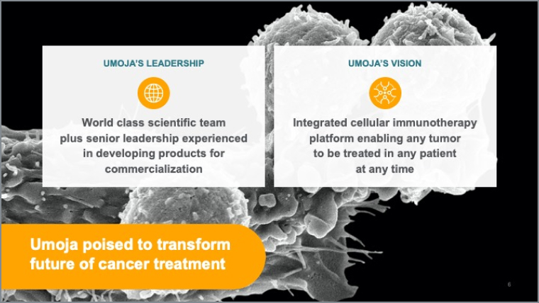
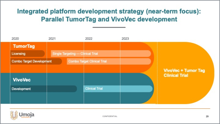
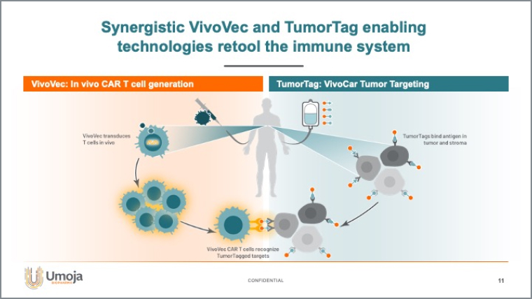
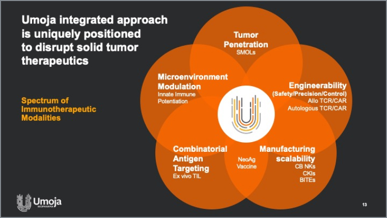
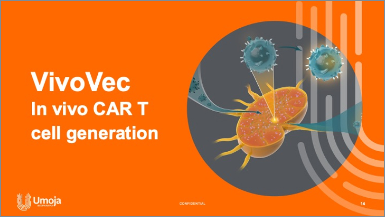
The presentation brings Umoja’s full story to life as a series of slides, underscoring the website messaging but going much deeper into the science, with detailed slides for both the VivoVec and TumorTag platforms, including clear, concise infographics and data. We built it to be exceedingly flexible and easy to use with a full suite of master slides built into the template that allow for additional information and points to be added, updated or evolved as investor conversations, ongoing research, and new data indicate.

Website
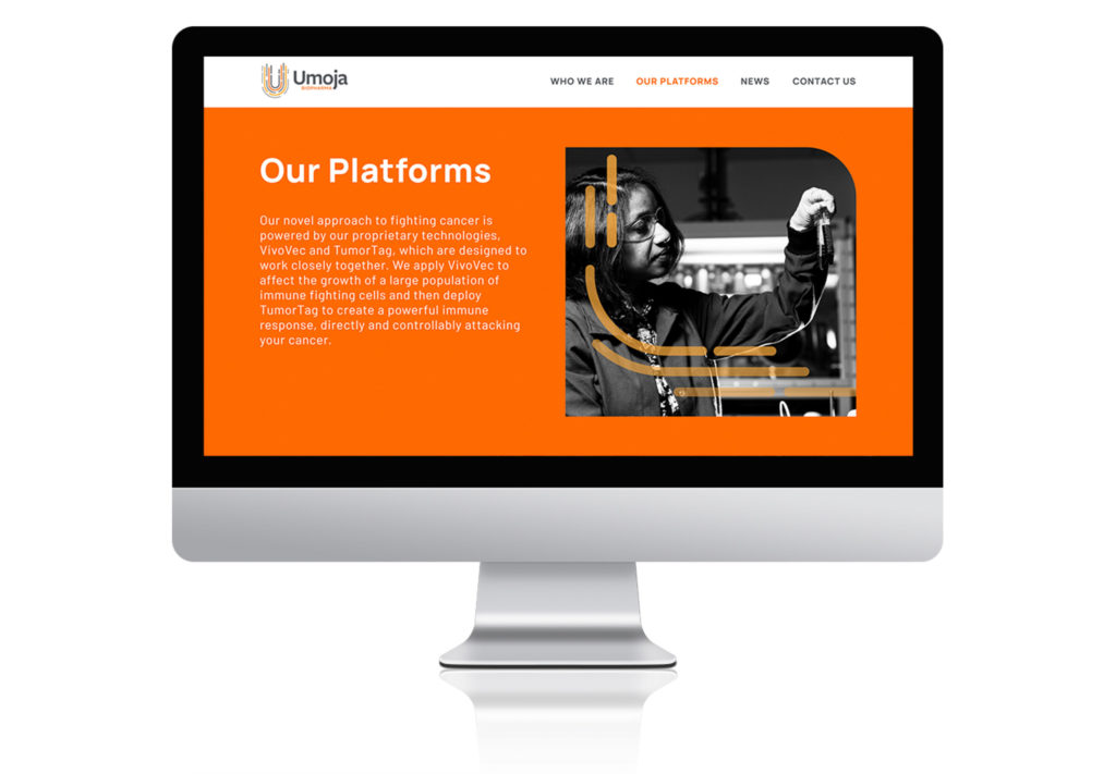
Umoja’s homepage features patient portraits combined with a bold, impactful, colorful backdrop. This commands your attention towards the patient—who lies at the heart of Umoja’s therapies. From there, users are invited to discover the science behind the VivoVec and TumorTag integrated platform through one easy-to-digest diagram.
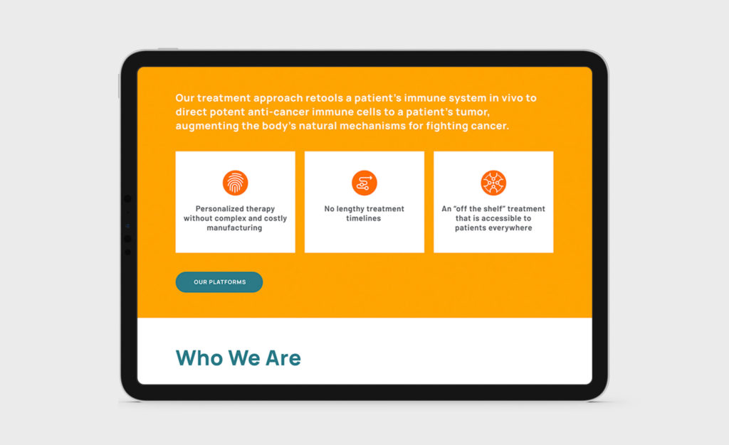
To allow content to expand and the website to remain fresh, we built the site with a custom WordPress theme, enabling the client to make updates via an administrative backend which was a cost-effective and efficient approach. We designed and developed it to be responsive so the user experience was optimized whether viewed on a desktop, tablet, or mobile device.

Impact
Umoja has been extremely pleased with the response from those in their universe—from investors to partners to their internal team—who appreciate the clarity with which this new and complex approach is presented, celebrating the science but in a visual way that makes it easy to understand. The components of the rebrand are proving to be incredibly useful for the company as they continue with their groundbreaking immunotherapy work.

