Approach
To create momentum around this program, the graphics had to be impactful.
Being mindful that these NTDs are treated at a community level—and by community volunteers—we wanted to feature graphics that were relatable at a local level.
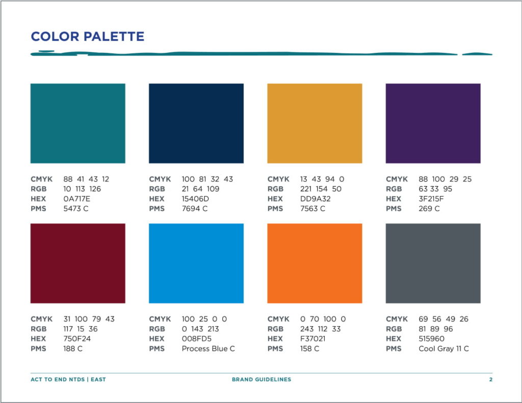
We spent time researching graphics, colors and patterns relevant to the different geographic areas where the program was launching.
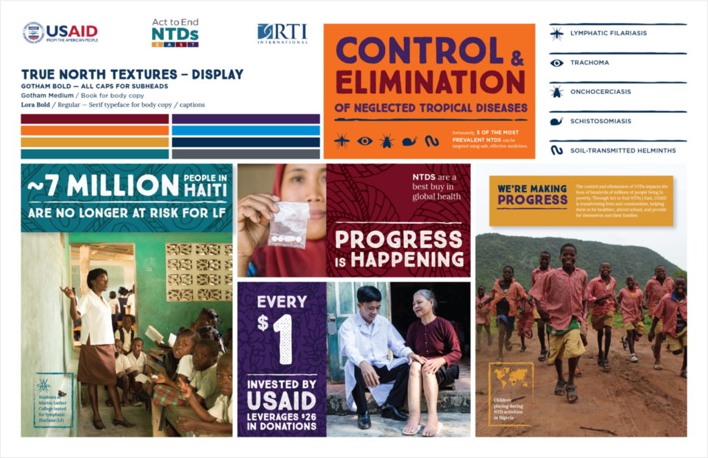
Armed with our research, we began as we do with all branding projects, by developing mood boards to explore color, fonts, brand imagery, iconography, and other graphic devices. Knowing the client’s stance that imagery should always focus on the positive and never exploit poverty, we designed hand-rendered patterns and paired them with optimistic key images from local towns and villages, a bold use of color, and typography with a hand-rendered style. With all of these elements working together we were able to create a brand that felt genuine, active, and energetic.
Brand Collateral
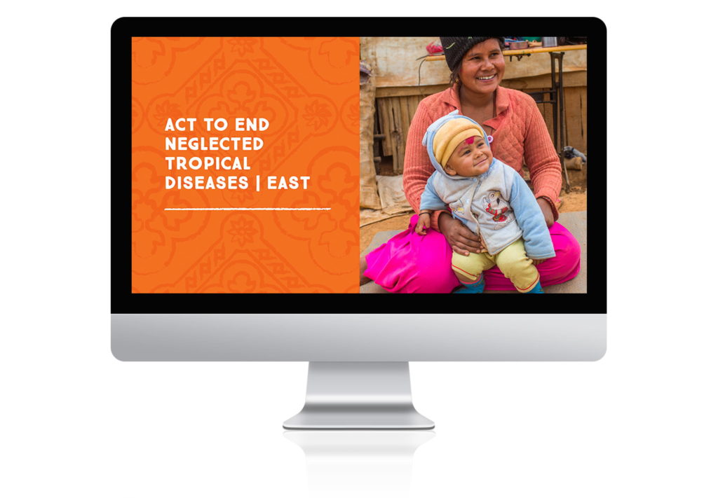
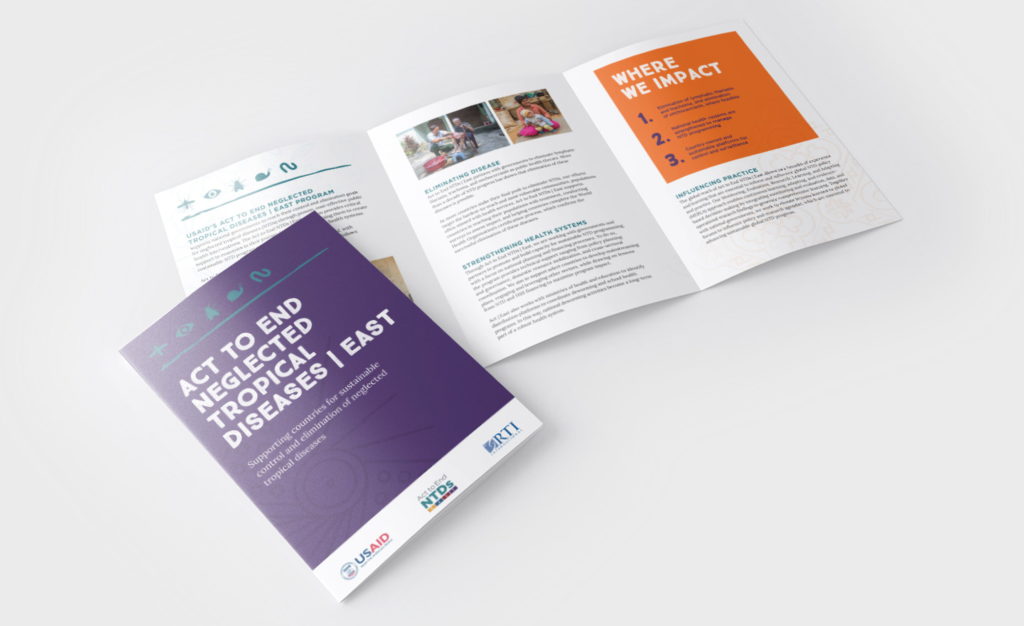
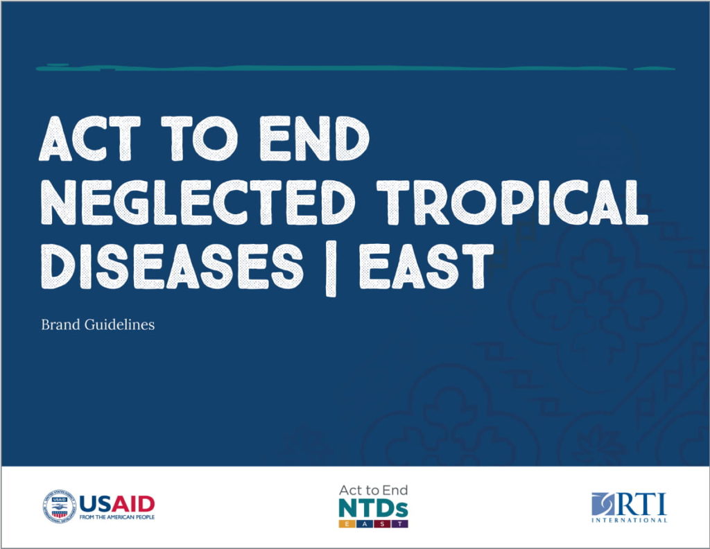
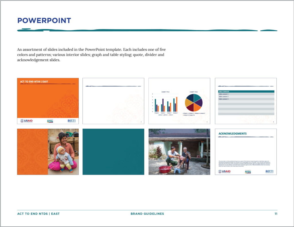
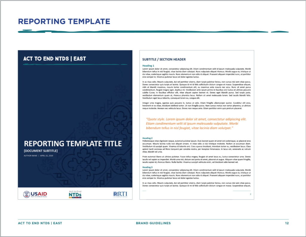
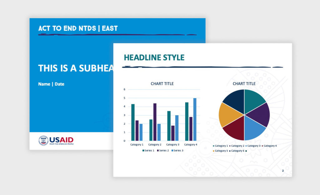
The branding was rolled out as an overview brochure, comprehensive PowerPoint templates with multiple options for color and pattern combinations and reporting templates. Each of these features different combinations of colors and patterns to keep the brand fresh and flexible.
“The [launch] event went wonderfully, we even made the cover of the local paper! Overall, the design made the whole event come together and look very polished.”
—Laura Cane, RTI International, Senior Communications Specialist, Neglected Tropical Diseases Global Health Division
Impact
Making the cover of the local paper in Uganda, the official program launch was met with great enthusiasm. The RTI leadership team and USAID were pleased, specifically stating how much they like the new look and feel for the program.

